Fraudulent Telegram and WhatsApp groups
Please beware of fraudulent Telegram and WhatsApp groups impersonating PSG Financial Services, our divisions and our advisers. Be cautious, verify links and contact your adviser or Client Services if you have any queries or concerns.
18
August 2021
Relativity in the investment world

Schalk Louw, Wealth Manager
Wealth
Relativity in the investment world is as important as it is in the real word. Let’s use the Covid-19 pandemic as an example: South Africa and Italy both have a population of around 60 million people. We know that Italy was one of the hardest hit countries in the world at the onset of the pandemic, and until the end of 2020, they lost an average of 185 people per day to Covid-19.

“ Offshore investments, especially in developed countries, was a good place to be these past few years. ”
South Africa was hit just as hard, but lost relatively fewer people to Covid-19 with an average of 100 deaths per day until the end of 2020. Italy was more successful with their vaccination programme this year, however, and up to and including 16 August 2021 (according to the WHO), 31.4 million people were fully vaccinated. Here, South Africa was relatively slower with the roll out of their vaccination program and over the same period, only 3.7 million people were fully vaccinated. While Italy’s Covid-19-related deaths declined from an average of 181 per day at the beginning of this year to 47 per day over the past three months, South Africa’s death toll rose to an average of 215 per day for the whole of 2021 so far, with this figure now on the rise at a current average of 239 per day over the past three months. It therefore clear that the second and third waves have hit SA much harder than it hit Italy, and I would argue that is largely due to Italy’s successful vaccine rollout programme.
I’m well aware that there are variables such as seasons, virus mutations and demographic profile that will have an effect on these figures, but this just shows why the relativity principle (and seeing the bigger picture) is so important when making comparisons.
The same relativity principles can be applied in the investment world where they are just as versatile. It can be used to tell you more about where we stand marketwise, and even though it’s mostly based on historical data, it can also tell you how cheap or expensive a particular share, currency, commodity, bond or sector is relative to another.
Studies have shown that more than 90% of good long-term investment results are achieved through proper asset allocation, and only 10% through good sector and market timing. A balanced portfolio can be divided into five main asset classes: the money market, local bonds, property shares, local shares and offshore investments. For ease of reference, I have allocated 60% of offshore investments to a World Equity Index and 40% to a World Government Bond Index. Diversification remains an investor’s best defence against risk and that’s why it’s so important not to focus on just one of these asset classes.
All five of these asset classes have historical returns history. By comparing these returns with one another you can get a good indication of how cheap or expensive they are compared to one another. If we use shares as an example, you will see that this asset class’s historical average earnings yield (over the past 15 years) is trading at 93% (0.93 times) compared to the average earnings of the remaining four asset classes (money market, property shares, local bonds and offshore investments).
Graph 1: FTSE/JSE All Share Index earnings yield relative to other asset classes
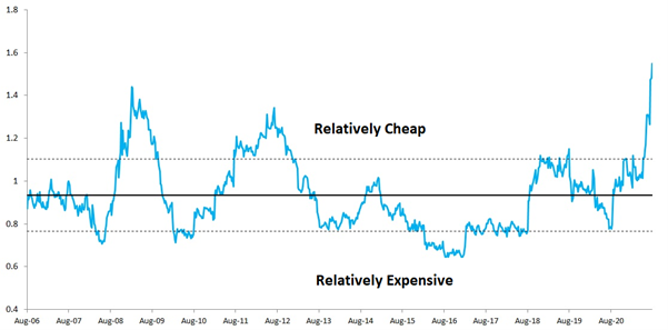
Source: PSG Old Oak & Iress
At the current 155% ratio, it’s showing us that local shares’ returns are still trading relatively cheap against the other asset classes, and also that it hasn’t been this relatively cheap in the last 15 years. Of course, this includes the 2008 correction. Now, this doesn’t mean that you should invest all of your capital in this one asset class, but rather that you should be careful to not exclude it from your portfolio entirely.
Graph 2: SA money market rates relative to other asset classes
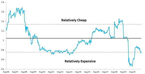
source: PSG Old Oak & Iress
Following the past almost two years’ interest rate cuts, the money market has offered relatively little value. Offshore investments, especially in developed countries, was a good place to be these past few years. But because this model mainly looks at relative returns, I want to urge investors to approach offshore investments with GREAT caution, simply because this model doesn’t really look at foreign exchange. The relativity indicator is showing us that this asset class is now offering relatively less value and this may mean that you should consider rebalancing to ensure that you remain well within your personal risk profile.
Graph 3: Offshore investments relative to other asset classes
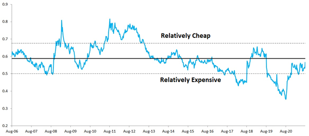
Source: PSG Old Oak & Iress
The relativity indicator is showing us that you should still be cautious when considering investing in the SA property sector. The SA Bond sector is looking similar to SA Shares – very attractive. This is mainly due to SA’s downgrade to junk status last year.
Graph 4: SA All Bond rates relative to other asset classes
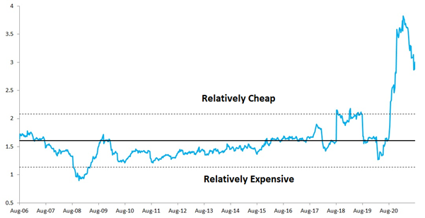
Source: PSG Old Oak & Iress
In conclusion, our investment environment remains challenging. But you can manage your own portfolio, provided you firstly look at proper portfolio diversification and secondly, by limiting overweight positions in assets that are offering you relatively less value compared to others.
Stay Informed
Sign up for our newsletters and receive information on finance.
