Fraudulent Telegram and WhatsApp groups
Please beware of fraudulent Telegram and WhatsApp groups impersonating PSG Financial Services, our divisions and our advisers. Be cautious, verify links and contact your adviser or Client Services if you have any queries or concerns.
06
September 2021
How close is the USA to a crash?

Schalk Louw, Wealth Manager
Wealth
On several occasions in the past, I have referred to the fact that no one can determine what will happen tomorrow with absolute certainty. Some readers may disagree with me. If it’s Friday today, then I can tell you with absolute certainty that I will braai tomorrow. That’s a sure thing. In fact, I can tell you that I’m going to braai a standing rib (‘staanrib').

“ On more than one occasion Buffett has mentioned that one of the most important pillars of his investment decisions rests on probability. ”
But the truth is that I’m planning to braai tomorrow and based on what I do most Saturdays, there is a high probability that I will in fact braai. And I emphasise the word ‘probability’ here. What will happen if I fall ill between now and tomorrow? Based on what I normally eat when I’m ill, there’s a higher probability that I will end up eating chicken noodle soup instead of ribs.
There are a multitude of variables that may prevent me from braaiing. But it’s important to know that if the weather forecast for Saturday looks good, if I stay healthy, and based on what I normally do on Saturdays when the weather is good and I’m healthy, there is a high probability that I will braai on Saturday.
If I should ever be so lucky, one person that I would love to invite to a braai would be well-known investor, Warren Buffett. On more than one occasion Buffett has mentioned that one of the most important pillars of his investment decisions rests on probability. In his own words: “We make investment decisions based on our evaluation of the most profitable combination of probabilities.”
This week I would like to apply the concept of probability – not to look for investment opportunities, but rather to answer the question of what the probability is of a market crash, or more specifically, a crash in the US stock market, the largest stock market in the world. In an attempt to answer this question, I will discuss three indicators that address the probability of a US market correction.
1. MARKET CAPITALISATION AS A PERCENTAGE OF GDP
I mentioned Buffet earlier, but this ratio is also known as the Buffett indicator. This ratio simply measures the total USA market capitalisation (Wilshire 5000) as a percentage of USA GDP, and it shows us when the US stock market is trading in inflated territory. Every time that the market capitalisation (size of the market) traded at higher levels than GDP over the last 30 years (i.e. higher than 100% of GDP levels), the US stock market was not only trading at levels close to boiling point, but it also experienced a massive correction shortly thereafter.
Graph 1: Wilshire 5000 Total Market Full Capitalisation Index as a percentage of USA GDP
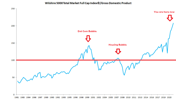
Source: @schalklouw & Refinitiv
Not only are current levels more than 100% the size of GDP, but it’s trading at more than double the size of GDP (i.e., more than 200%), which is much higher than the Dot Com bubble and USA Housing bubble levels. This indicator therefore, shows us that the probability of a market correction is quite high.
- Price-to-earnings ratio levels
The price-to-earnings ratio (P/E) has to be one of the most used ratios when it comes to the valuation of shares, and it is calculated by simply dividing the price of a share (or index) by its earnings. The higher the P/E, the more expensive the share. However, the problem with the standard P/E, is that it only considers the past 12 months’ earnings, which doesn’t give us a good cyclical image. That is why experts prefer to use the Shiller P/E, a.k.a. the CAPE ratio. The CAPE ratio uses basically the same formula as the standard P/E, but it considers the share’s earnings over a 10-year period to take into account and smooth out any fluctuations in corporate profits that occur at different intervals during a business cycle.
Graph 2: S&P500 CAPE ratio and USA long-term interest rates

Source: Robert Shiller
Even when we look at the cyclical price earnings ratio (CAPE) of the US stock market (S&P500) over the last 150 years, it’s important to note that every time this ratio skyrocketed, a sharp market correction followed soon thereafter. Now, while the US market is not yet trading at the Dot Com levels last seen in 2000, we have surpassed 1929 levels and I think it’s safe to say that the probability of a market correction according to this indicator, is getting higher by the day.
- USA 10-year Treasury Constant Maturity minus 2-year Treasury Constant Maturity
When we look at the difference between the US 10-year Treasury Constant Maturity rate and the 2-year Treasury Constant Maturity rate, you will see that every time the short rates traded higher than long rates over the past 45 years (i.e., where the difference was negative), the USA experienced a recession within the 2-year period that followed.
Graph 3: Difference between the US 10-year rate and the US 2-year rate
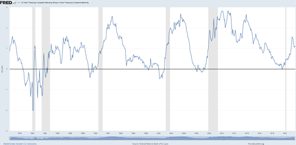
source: FRED
Although we did find this difference in negative territory at the end of 2019 for a short while, and saw the USA in a recession for a short while thereafter, at current levels things are still relatively normal. That means that according to this indicator, the probability of a market correction is not as high as with the two other indicators. Be warned, however: the US Federal Reserve already indicated that the next interest rate move will most probably be upwards, which may push the 2-year rate upwards and could lead to a negative difference, so be very, very careful.
I would like to wish all readers a wonderful Heritage Day on 24 September. Enjoy your braai!
Stay Informed
Sign up for our newsletters and receive information on finance.
